Posts

Quarter 3 Submission Post
Image
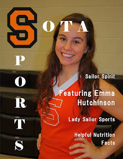
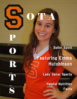
  Overall, many revisions were made. The text was justified and columns were made. One of the photos in the article was made the main focus instead of a bunch of smaller ones. Page numbers were also added. As for the table of contents, the original article background was used for the table of contents instead and the article was changed to a plain white background. This was more conventional. The title was stretched across the top, filling the empty spaces. For the cover page, the picture was made bigger and the smaller text was slightly adjusted with the font and positioning.  
Cover Page Revisions

Image
The first picture is after revisions were made. I made the photo bigger so that the main focus filled more of the page. After making the photo bigger, then there were fewer empty spaces and it looked much better. I also changed the font and spaced the words out more for the text on the side. The font I chose was sleeker, and I did this because I did not want to take too much attention away from the title. 

Table of Contents Revisions

Image
The photo on the left was before revisions were made and the right was after. I changed the background of this because the white stripe that cuts right down the middle seems to make everything else to be washed out. It was also breaking up the page a little bit. This new background looks more evenly distributed throughout, which is more appealing to look at. I also stretched the title across the whole top of the page, filling more space. Before this space was not being used for anything and it was empty.  

Article Revisions

Image
These revisions were made on Indesign. The top two images are before I made my revisions after experimenting with Indesign in class. The bottom two are after I made my revisions. The text was more spaced and much easier to read. The main photo on the first page was changed to something I thought the readers would be more interested in. This picture was also moved and expanded to fill almost all of the top half of the magazine. Therefore the title "Sailor Spirit" is overlapping this photo. It was strategically placed in the open area of the sky making it easy to read. In the first revision, the text at the bottom of the page was bunched together making it illegible and you are unable to read it. I was able to fix this problem and now all the words are visible. 

Distribution Plan

For my distribution plan I will be creating a website. This method is very beneficial to those who aren't able to access a physical copy of the magazine. The website will provide easy access to articles that are published by Sota Sports and it will also require a subscription fee. You would also be able to do a free month trial to see if you like the content that is being provided. In order to create publicity for the website it will be promoted through a sports event. The event will be for those who are interested in the specific sport that is being featured in the magazine. For my article it may be something like a cheer leading convention. Overall, this would draw more people to read the magazine and become interested in our product.

Digital Distribution - Baseball Digest

Image
For digital distribution, another example that I found was with Baseball Digest. This magazine has some of their articles online and it gives you the option to download them as a PDF. These PDF's can be sent out to peoples emails and it can also be found on a website. This method is beneficial to both the distributor and the reader because PDF's are easy to distribute and also easy to access. This method would be beneficial to Sota Sports because when the article is downloaded, it can be accessed at the readers convenience. This was they can read it whenever they would like. The PDF can be access on mobile devices such as phones and computers.

Digital Distribution - World Soccer

Image
For digital distribution, another example that I found was from World Soccer. They provides their magazine on a website. This is easily accessible and helps to increase the popularity of the magazine. If the reader is reading and they are interested in the article, them may want to read more. Conveniently, all they have to do is tap their screen to access more.  However, in order to make a profit, they have made it where you have to pay to gain access to all the different articles. The method of publishing issues and articles on the website is very smart and helps the company to gain more publicity since it is so easy to access. This is why I would also create a website. Along with this, charging a small amount for the audience to access these articles would help to profit from the business.