Posts
CCR Question #4 Draft
Some of the technology that I have used in this process include my iPhone 11 to take photos for the magazine. The camera quality of this is very good and clear. However, in the process of transferring the photos into the actual magazine, their quality got disrupted and became a little bit blurry. A design software that I used was Publisher and Adobe Indesign. At first, I used Publisher because it was easy for me to grasp how to use it. After I went to the more advanced software and it took a while for me to learn everything but eventually I got it down. Some of the tools I used in these programs include the justify text tool, I was able to create columns, and make text boxes for both text and photos.
CCR Question #3 Draft
Throughout this process, my production skills have greatly increased. I have learned how to use many different programs such as Publisher and Adobe Indesign. These played a big part in the outcome of my magazine and the organization of it. I also learned how to enhance photos in photoshop and make the picture more appealing. As for working together in a group, we have all learned how to communicate our ideas with each other. For my magazine, it also took communication to get certain people together for the photoshoots. Overall, I would say my skills have greatly evolved compared to when I first started.
CCR Question #2 Draft
From my audience engagement research, I have learned that each magazine or company has its own specific target audience. They post certain content in order to attract more of this audience. They can do this by uses specific photos or titles in their magazines being published and also in their advertising and marketing. Many magazines are able to market their products through websites, social medial, and more. My marketing plan consists of using social media outlets such as Instagram and Twitter. It will be a business account so ads will be able to pop up on people's feed without them even having to follow anything. From the distribution research, I have learned that magazines can be distributed in many different ways. This includes websites, apps, PDF's, and more. The way a magazine is distributed can greatly affect how much popularity it can get. People like things when they are easy and convenient to access. My distribution plan will include a website. Having a website provi...
CCR Question #1 Draft
Our group's magazines all represent womans sports. More specifically, my magazine focuses on cheerleading. It is able to clarify some of the things that cheerleaders do and are capable of. It also mentions specific information that a person considering cheerleading may be interested in. This would lead to them being interested in the content and then wanting to read the magazine. Some of the conventions that were used throughout my magazine include a bold font. This really helped to draw the reader's attention to where the more important information was. Another one was the use of the orange background color. This tied into all of the other pictures that included orange as the main color. Also, the variety of photos and subjects being photographed helped to keep the readers interested in what they were looking at. A convention that was challenged was the layout of the text on the cover page. Traditionally, it would be straight across the top, but in my magazine, it goes along...
Quarter 3 Submission Post

Overall, many revisions were made. The text was justified and columns were made. One of the photos in the article was made the main focus instead of a bunch of smaller ones. Page numbers were also added. As for the table of contents, the original article background was used for the table of contents instead and the article was changed to a plain white background. This was more conventional. The title was stretched across the top, filling the empty spaces. For the cover page, the picture was made bigger and the smaller text was slightly adjusted with the font and positioning.
Cover Page Revisions
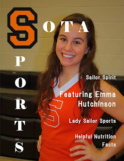
The first picture is after revisions were made. I made the photo bigger so that the main focus filled more of the page. After making the photo bigger, then there were fewer empty spaces and it looked much better. I also changed the font and spaced the words out more for the text on the side. The font I chose was sleeker, and I did this because I did not want to take too much attention away from the title.